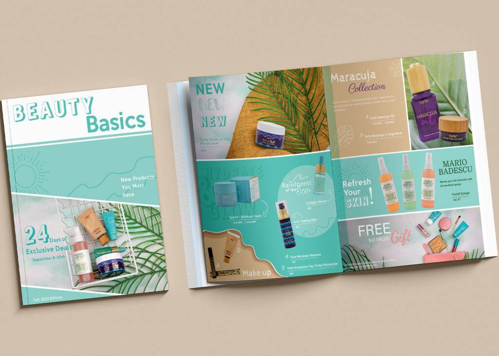
Beauty Catalog Design
Overview
This project was to design a magazine page cover and spread, after photographing products in a light tent and also creating top down photography shots.
Design Process
Photography
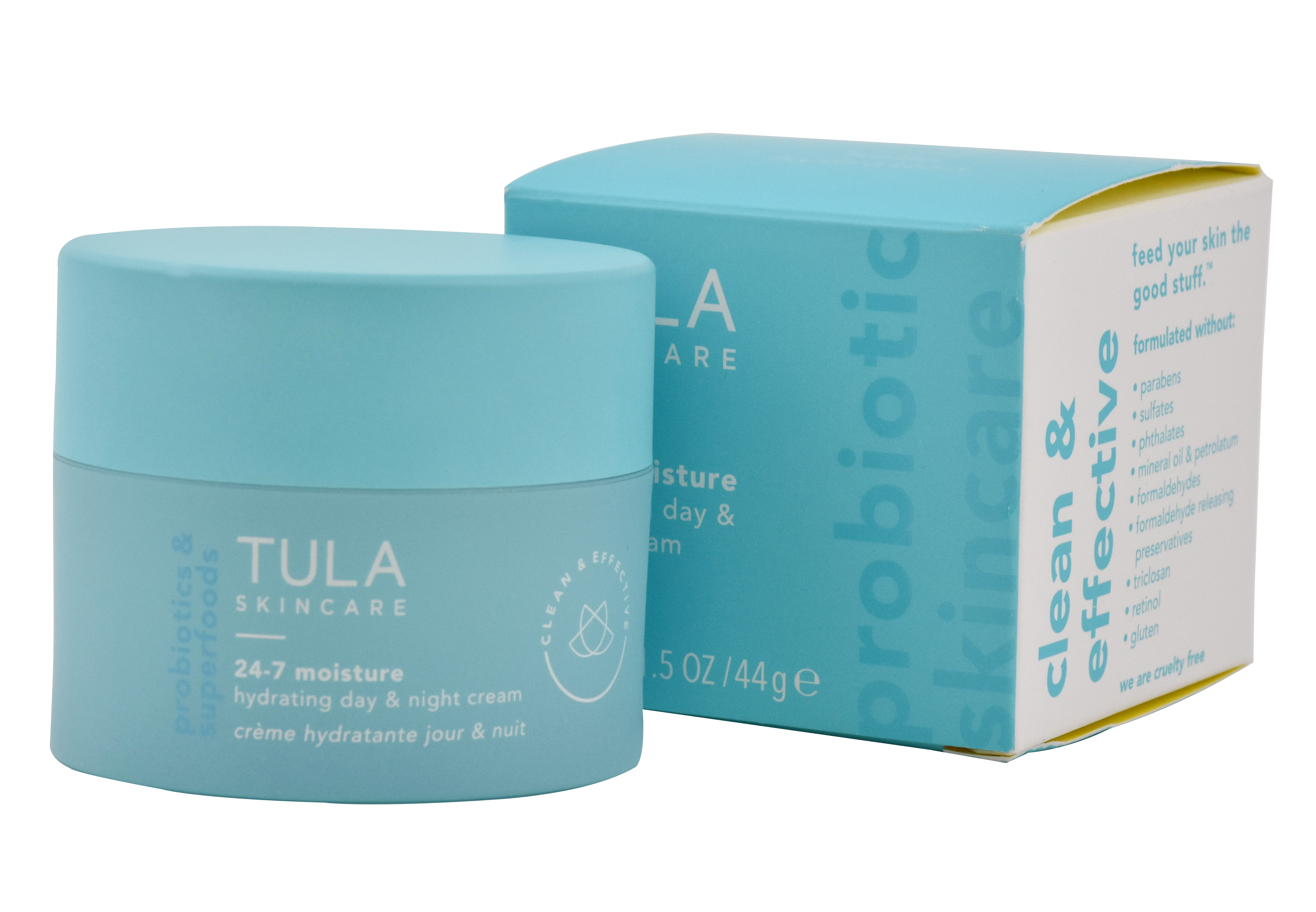
The first steps were gathering the products and setting up the light tent to photograph the products with a white background. This gave good, solid, bright lighting on the products with a pure background to easily mask them out in Photoshop.
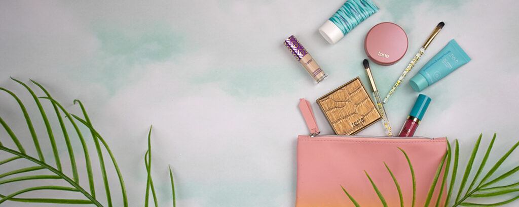
I also needed to take some top down photographs for content in the magazine layout. I tried multiple ideas with ways to display the products in an intriguing manner.
Page Design
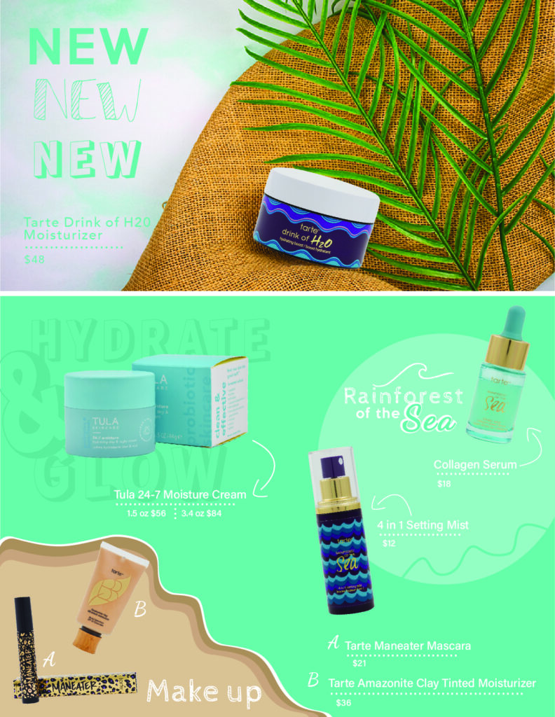
When designing the magazine spread, I wanted to focus on bright, vivid colors that complimented the products. I used typography to enhance the design by adding an opaque phrase behind a product and also using a mix of typefaces to focus on the Rainforest of the Sea Collection. When designing, I incorporated the makeup in a spill of foundation shades, but with the blue background it can also be seen as sand and the ocean for the Sea Collection.
Final Design Layout
